
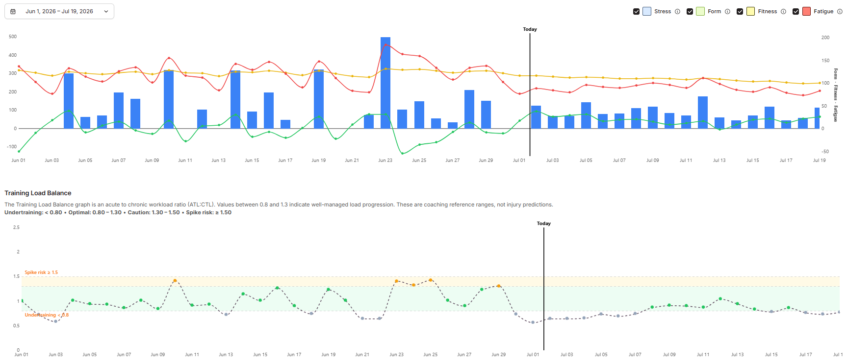
EndoGusto turns each athlete's daily ECOs scores into two graphs on the Performance page: the Performance graph (Fitness, Fatigue, and Form) and the Training Load Balance graph. One score on its own tells you very little. These two graphs stack the scores over time so you can see whether an athlete is building fitness, carrying fatigue, or pushing harder than their baseline.
Both graphs measure external load, the objective work an athlete performed in ECOs, not the internal heart-rate stress that work created. This guide explains what each graph shows and how to read the two together.
What Both Graphs Measure
Both graphs are built from the same input: external load, expressed in ECOs. External load is the work you prescribe and the athlete performs, such as time at a given pace or power. It is objective and reproducible, which is what makes it a stable base for tracking a season.
This is separate from internal load, the body's physiological response to that work (heart rate, perceived effort). Two athletes who complete the same prescribed session earn the same ECOs, even if one was more strained that day. The graphs track what was done, not how hard it felt.
For a full explanation of how ECOs is calculated, see the Understanding ECOs article.
The Performance Graph: Fitness, Fatigue, and Form
The Performance graph, sometimes called the FFF graph, turns daily ECOs into three lines.
- Fitness (CTL): long-term load, a 42-day exponentially weighted average of daily ECOs. It builds slowly and lingers for weeks.
- Fatigue (ATL): short-term load, a 7-day exponentially weighted average. It spikes within a session and clears within days.
- Form: Fitness minus Fatigue. It tells you at a glance whether an athlete is fresh, buried under load, or holding steady.
The two windows exist because the two responses fade at different speeds. The fatigue from Sunday's long run is mostly gone by Thursday, but the fitness that run contributed is still there a month later. This is also why Form climbs during a taper: fatigue drains faster than fitness, so the gap opens in the athlete's favor.
Both lines use an exponentially weighted moving average, which gives recent sessions more weight than older ones. Rest days count as zero load and still update the average, which is why Fitness ticks gently downward across a rest block rather than holdiνg flat.
The Training Load Balance Graph
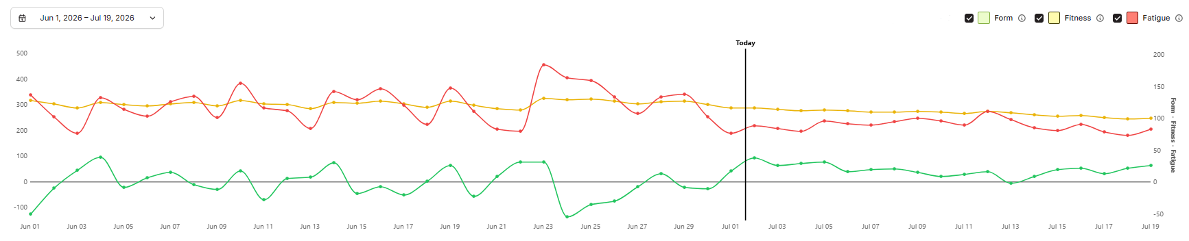
The Training Load Balance graph asks a different question: how hard is recent training pushing compared to what the athlete is already adapted to?
It divides an acute 7-day average of ECOs by a chronic 21-day average. A value near 1.0 means recent load matches the established baseline. Higher means the athlete is pushing above it; lower means they are easing off.
The two averages are computed uncoupled, which means the chronic window excludes the recent period rather than containing it. This keeps the comparison honest and avoids a false correlation between the two.
The Four Balance Zones
The graph bands the ratio into four reference ranges. Read them against the athlete's plan, not in isolation.
| Ratio | What it suggests |
|---|---|
| Below 0.8 | Low stimulus; load has dropped below the adapted baseline |
| 0.8 – 1.3 | Well-managed progression |
| 1.3 – 1.5 | Elevated; recent load is climbing fast, worth watching |
| Above 1.5 | Sharp spike relative to baseline; review the week |
These ranges are reference points, not verdicts. A ratio of 1.4 the week after a planned training camp is expected. The same 1.4 in an athlete who has been steady for months is worth a closer look.
Important: the zones are coaching reference ranges, not an injury predictor. A red zone is a prompt to investigate, not a diagnosis. It tells you load spiked relative to baseline; it does not tell you why, or whether that spike matters for this athlete this week.
Reading the Two Graphs Together
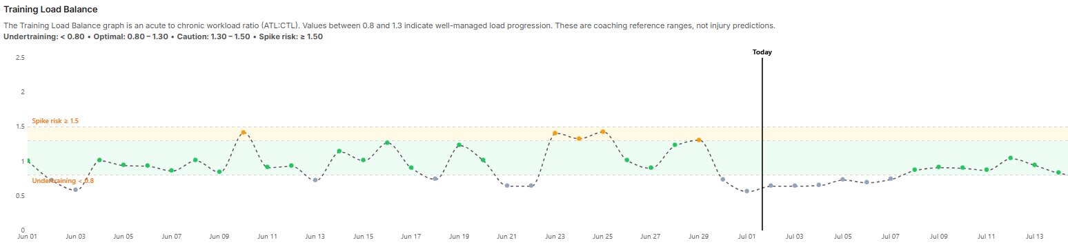
Neither graph is enough on its own. A worked example shows why.
Take a masters runner who has held a steady 450 to 550 ECOs per week for two months. Their Fitness line is flat, Form hovers near zero, and Training Load Balance sits around 1.0. Everything is in equilibrium, which is fine for maintenance but will not drive progress.
Now add a three-week build, ramping toward 800 ECOs per week:
- On the Performance graph, Fitness rises steadily while Fatigue rises faster, so Form drops and goes negative.
- On the Training Load Balance graph, the ratio climbs into the 1.3 to 1.5 band.
Read alone, that elevated balance might look alarming. Read together, the two tell a coherent story: the build is working, the cost is real and expected, and the athlete is carrying planned fatigue.
A down week follows. Fatigue falls quickly, Form rebounds above zero, and the balance settles back toward 1.0 as the chronic baseline catches up to the new, higher load. Performance tells you where fitness sits and how deep the hole is; Balance tells you how fast you got there relative to baseline. You need both to make the call.
What These Graphs Do Not Show
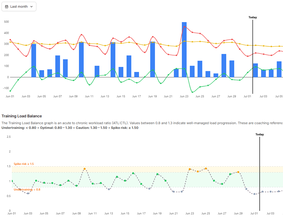
Everything in both graphs is external load: the dose, not the response. Two athletes can complete the identical prescribed week, land on identical Fitness, Fatigue, and Balance numbers, and still be in different physiological states, because one slept well and trained in cool conditions while the other fought a cold in the heat.
That is by design. External load measures the work itself, the same way every time, which is what makes it a stable base for a season. Heart rate and perceived effort measure something different and equally real: how a specific athlete absorbed that work on a specific day. Both belong in a complete read, but the objective account comes first.
Tips for Coaches
- Read the trend, not the session. A single ECOs score is only a data point. The coaching signal comes from how the lines move across days and weeks.
- Always read Balance next to Performance. An elevated ratio during a planned build is expected. Check Form and Fatigue before reacting to a number.
- Keep thresholds current. The graphs are only as accurate as the ECOs feeding them, so set each athlete's pace and power thresholds on their Training Zones tab.
- Expect Fitness to dip on rest blocks. Rest days count as zero load, so a gentle downward drift during recovery is normal, not lost fitness.
- Treat a red balance zone as a question, not an alarm. It flags a spike relative to baseline. What it means depends on the plan and the athlete.
Need help? Contact us at Support & Feedback or browse the Knowledge Base.